Please update your browser
Your current browser version is outdated. We recommend updating to the latest version for an improved and secure browsing experience.
Color and Line

“Through arrangements of lines and colors, using an ordinary subject taken from life or nature as a pretext, I obtain symphonies, harmonies that do not represent anything wholly real in the vulgar sense of that word, not directly expressing any idea, but provoking thought, without the aid of ideas or images, simply through mysterious affinities between our brains and certain arrangements of colors and lines.”
Paul Gauguin, Interview with Eugène Tardieu (May 1895)
Harmony and Emotion
Color is the most sensuous and immediately affecting aspect of art, and it is also the most difficult to describe. Each hue technically corresponds to particular wavelengths of light, but (as Goethe demonstrated in the early 19th century), it is perceived relationally and in highly subjective ways. As a result, color has been treated as inferior to line, and even potentially suspect, within a trajectory of Western aesthetic theory since the time of Aristotle (ca. 330 BC).
At the height of the European art academies (from the late 17th to the late 19th centuries), the ideal was a form of balanced amplification within a harmonized composition. Raphael's Madonna in the Meadows (1506, left) is paradigmatic in the careful balancing of primary colors (the red and blue that Mary wears) with flesh tones and the shades of green that unite foreground, middleground, and background.
There is an alternative tradition that emerges in certain periods (such as the early Renaissance of the 15th century, the 17th century Baroque, and the early-mid-19th century Romantic period).
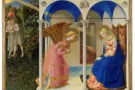
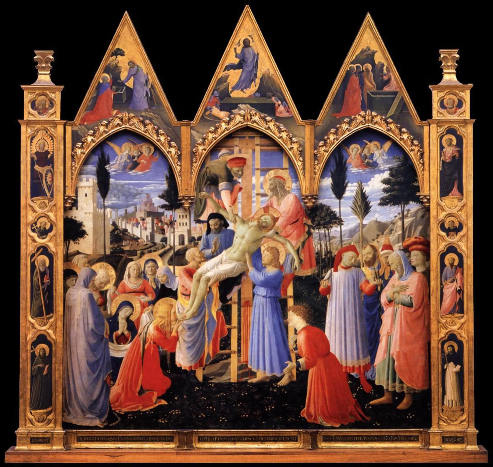
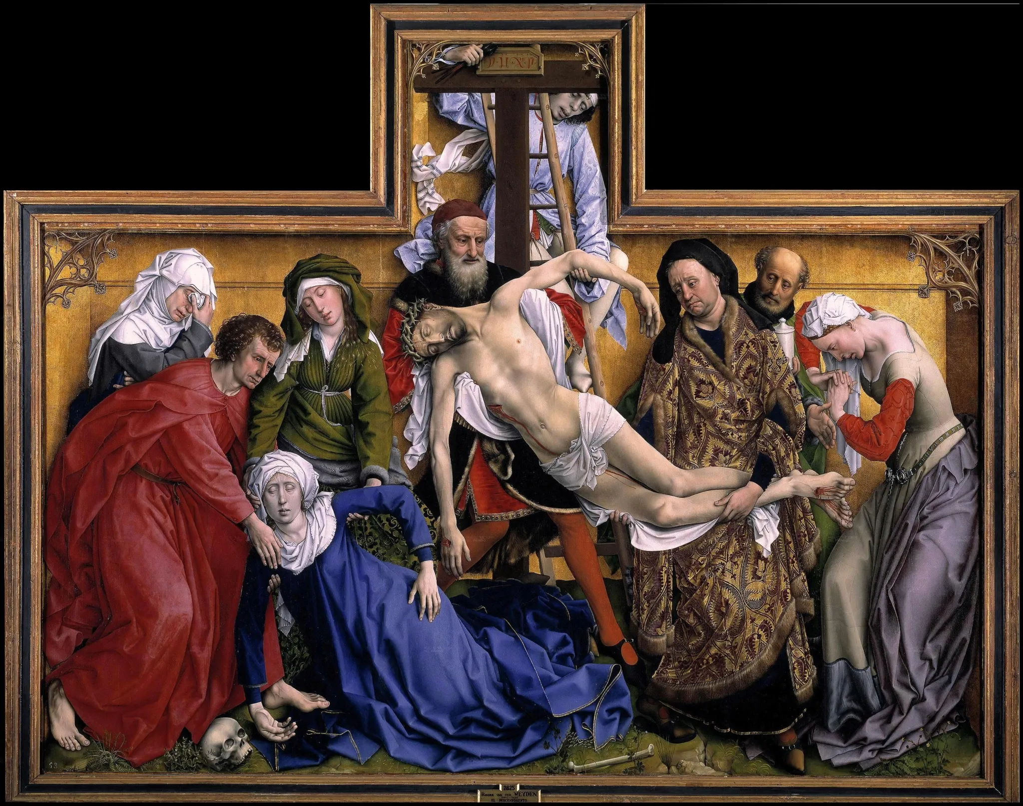
Within this tradition, epitomized by the Depositions below, color is used not merely as a form of decoration or a compositional supplement, but as another form of structure, linking figures visually and symbolically. In Fra Angelico's Deposition from the Convent of San Marco (1433, below) variations of blue and red are used both to organize groups of figures and to establish contrasts between the sacred mourners on the left and the figures of power on the right.
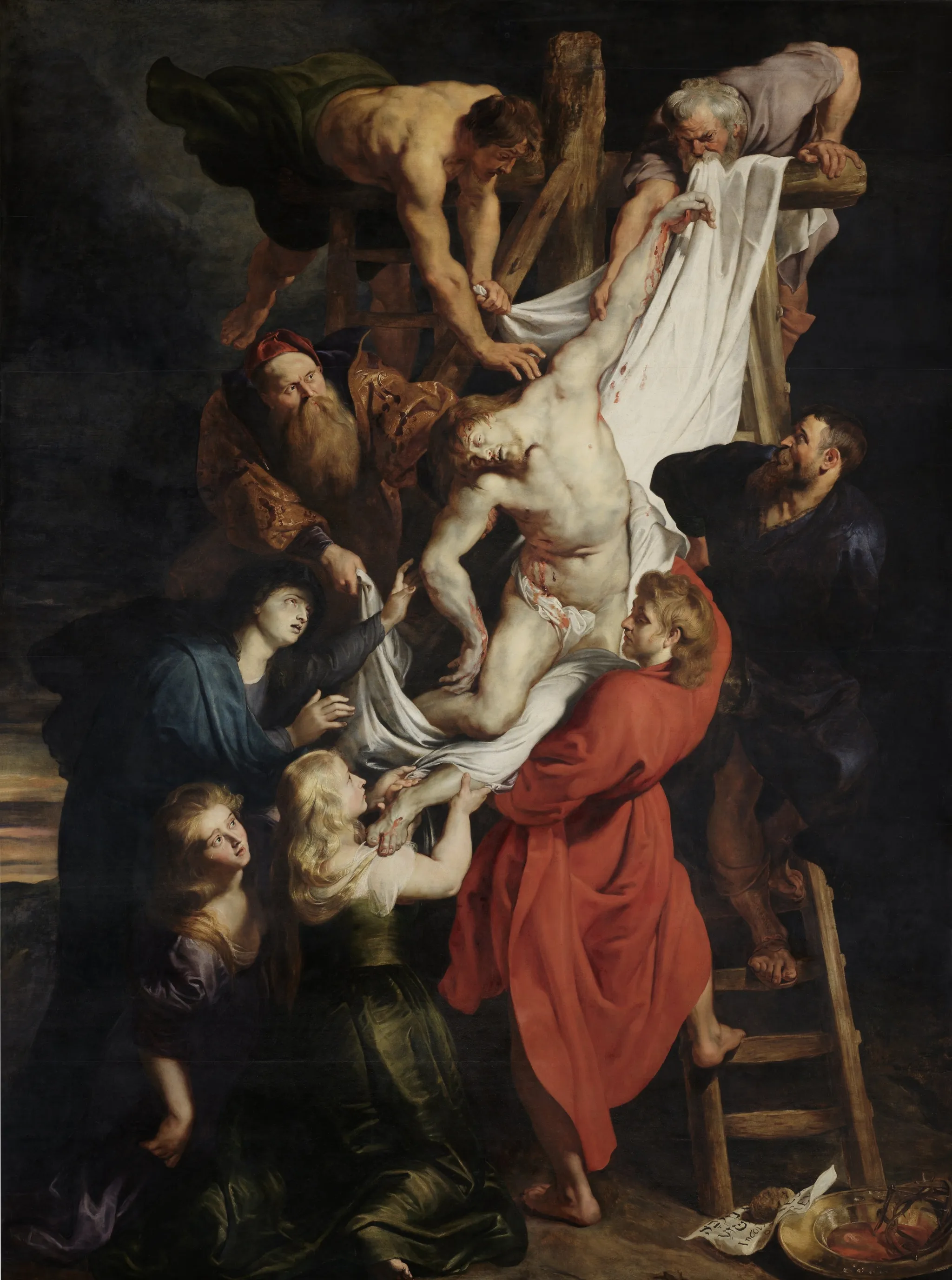
The consummate example is Peter Paul Rubens's Descent from the Cross Altarpiece in the Cathedral of Our Lady, Antwerp (1612-1614). The emotional weight of the scene is conveyed through the vividly rendered tears on Mary Magdalene's cheeks as well as the links between the sinuous curved lines of the composition and the movement of color from the traditional sacred blue worn by Christ's mother on the center-left to the vivid red of St. John the Evangelist on the center-right. The stark contrast between the red tunic and the white shroud helps draw attention to the (Eucharistic) relationship between pallid flesh and bloody wounds. It also enables the same tone of red to connect the central panel with the side panels, which all feature variations of Christ being carried, in Mary's womb in the Visitation to the left and in the Presentation at the Temple to the right. Rubens even extends this to the left front panel's legendary depiction of the giant Christopher ("Christ-bearer") carrying the Holy Infant across the water.
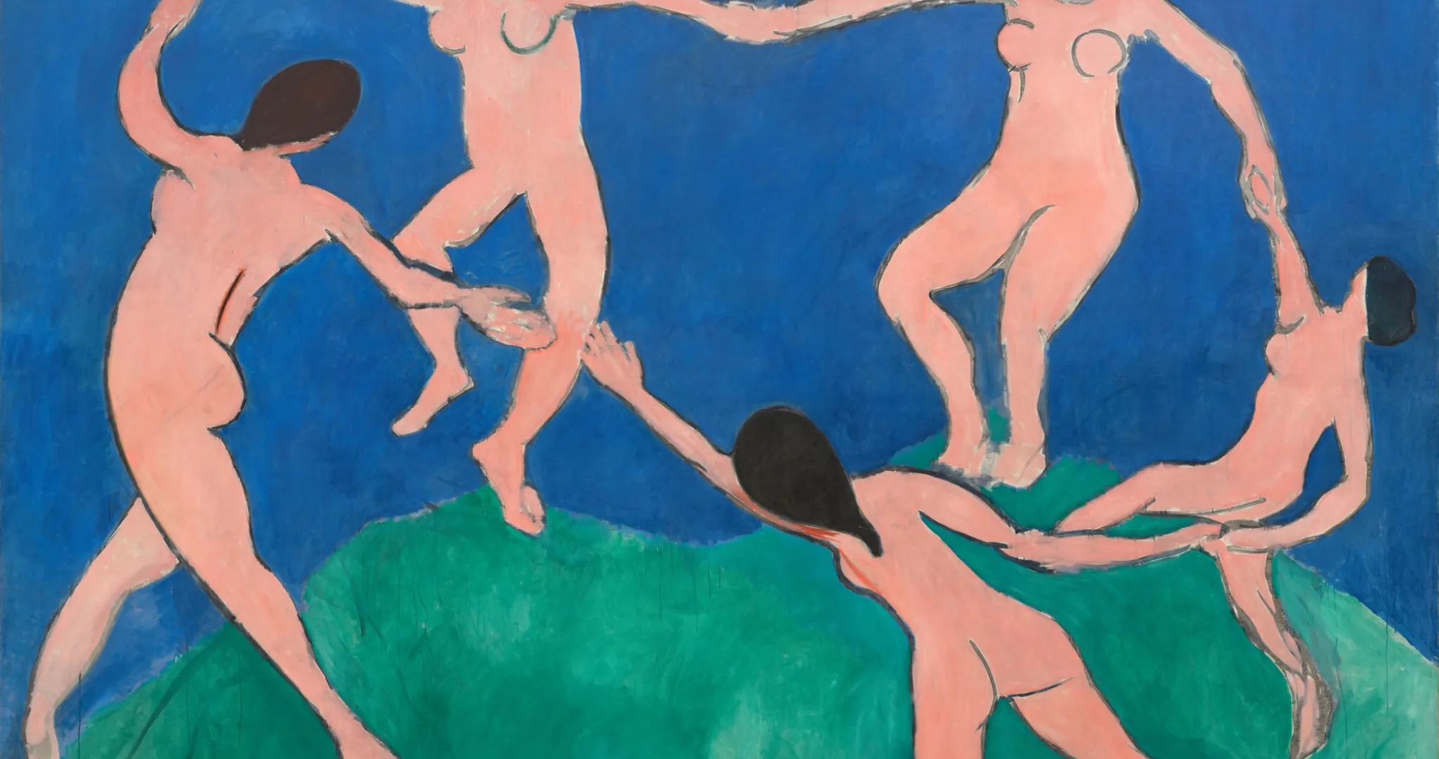
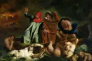
A widely read polyglot, Rubens was conversant with the major color theories of the era but his ideas live on most powerfully in the work of 19th century Romantic painter Eugène Delacroix. Delacroix was an ardent admirer who even traveled to Antwerp to study the master's works. His 1844 Deposition in Paris pays earnest tribute while also opening up new approaches to the depiction of color and darkness that would profoundly shape late 19th and early 20th century modern painters such as Paul Gauguin, Wassily Kandinsky, and Henri Matisse and the Fauves.
Kandinsky, tellingly, saw color as a vehicle for "the outward expression of inward meaning" that would help overturn traditional ideas of composition and "start the dance of the future." [i]


“Generally speaking, color is a power which directly influences the soul. Color is the keyboard, the eyes are the hammers, the soul is the piano with many strings. The artist is the hand which plays, touching one key or another, to cause vibrations in the soul.”
Wassily Kandinsky, Concerning the Spiritual in Art (1910)
References
-
Darius Khondji