Please update your browser
Your current browser version is outdated. We recommend updating to the latest version for an improved and secure browsing experience.
The Triumph of Technicolor


The Technicolor Process
The dominant form of color from the 1930s to the early 1950s, and the one that most profoundly shapes collective visual memories of the period, was Technicolor. It was a subtractive process that combined artisanal techniques with industrial technology to isolate parts of the light spectrum and recombine color layers from multiple strips of film.
The initial version, available in the early 1920s, used prismatic mirrors to direct particular wavelengths of light and produce a green and a red strip of film (there was no blue layer, as is demonstrated by the extract from The Toll of the Sea below). The more celebrated three-strip version redirected green at 90 degrees and combined blue and red on a single, double-layered strip that absorbed first blue and then red. These red, green, and blue strips and their complementary dyes (cyan, magenta, and yellow) were used to construct a color matrix through which dyes could be be imbibed directly onto the filmstrip. The matrix process made it relatively easy to heighten the intensity of colors by adjusting their saturation levels while the dye-transfer process resulted in highly stable, durable prints. A 35mm IB Technicolor print held in good storage conditions still retains virtually all of its original color.
Technicolor was an American company with proprietary involvement in every step of the production process, much to the chagrin of the Hollywood studios. In addition to using a Technicolor camera and lab, creating a Technicolor film entailed the use of special lighting equipment and dedicated consultants.
The key figure was Natalie Kalmus, wife of the founder, who argued in the 1930s that the greatest strength of the process was its fidelity and reproductive accuracy. This is certainly true compared with rival processes from the 1930s, but Technicolor also created a highly saturated tone that could create an impression of heightened intensity. Look, for example, at the final section of the extract from the early 3-strip Technicolor feature The Trail of the Lonesome Pine (Henry Hathaway, 1935, below).


Powell and Pressburger's Technicolor
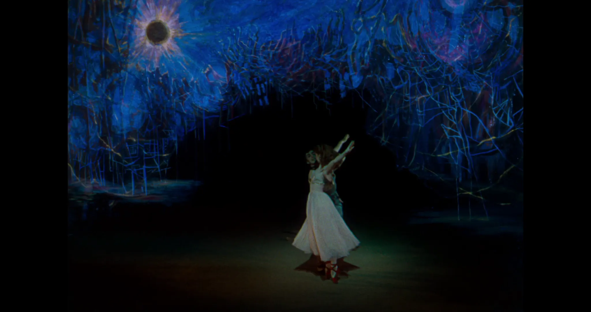
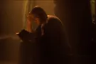
The potentially disorienting qualities of Technicolor could be used expressively, as these extracts from the films Michael Powell and Emeric Pressburger made with cinematographer Jack Cardiff in the late 1940s make clear.
This is especially true of The Red Shoes (1948), one of the most impassioned and obsessive films ever made. The film combines several myths and legends: of the Svengali and Diaghilev-like impresario Lermontov (named after the Russian Romantic poet), of the Ballets Russe (Leonide Massine, successor to Diaghilev, choreographed the dance sequences and adopted the same role inside the film), and of the great British female dancers of the era like Diana Gould and Margot Fonteyn. Both the brief repertory montage to the left and the eponymous ballet sequence ballet fuse elements of Symbolist movement, Expressionist design (set designer Hein Heckroth provides continuity with the Weimar-era silent cinema), and Fauvist bursts of color.
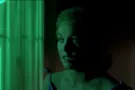
Bursts of color emerge even more distinctly in the sequence from Black Narcissus (1947) at the bottom. This is due to the relatively restrained palette, the Vermeer-like emphasis on spare window illumination, and the contrast between the pale skin and red makeup of fleeing nun Sister Ruth. The patches of red on her face and clothes also contrast starkly with the green/blue tones in the Expressionst (and clearly studio-shot) journey through the forest and with the more subtle grouping of background bottles and objects inside Mr. Dean's house. Encapsulating the seductive power and potential danger of intense color, Sister Ruth's escape is staged as a dance and ends with red enveloping the screen.

